
Google Politics & Elections
Ahead of the 2012 elections, Google turned its mission toward empowering voters with clear, accessible political information. As the web became the dominant source for political news and discourse, Google and JESS3 recognized its expanding role in elections—for voters seeking informed choices, campaigns sharing messages, and media accessing real-time data.
Neutrality was essential. In partnership with Google, whose reputation rests on unbiased information, I was the Creative Director on a team that led strategy, design, project management, and prototyping to help build an objective, comprehensive elections hub. Launched in late 2011, the first phase of Google Politics & Elections aligned with the start of the campaign cycle in Iowa.
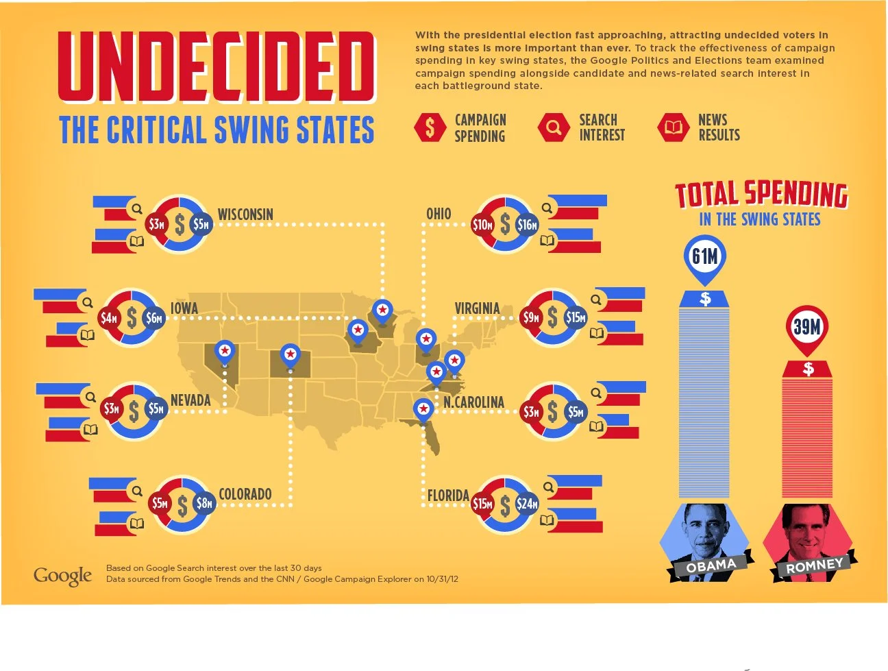
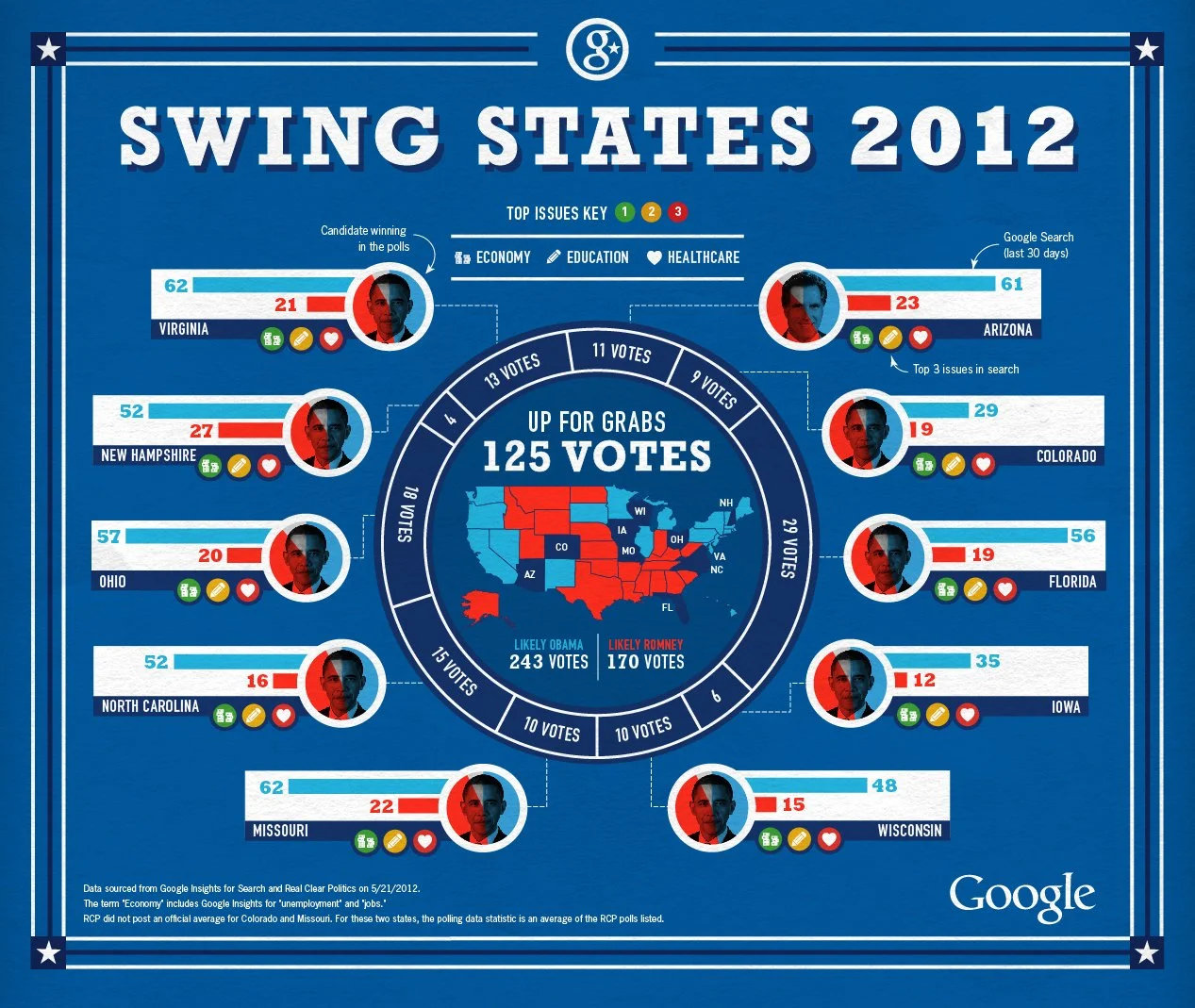
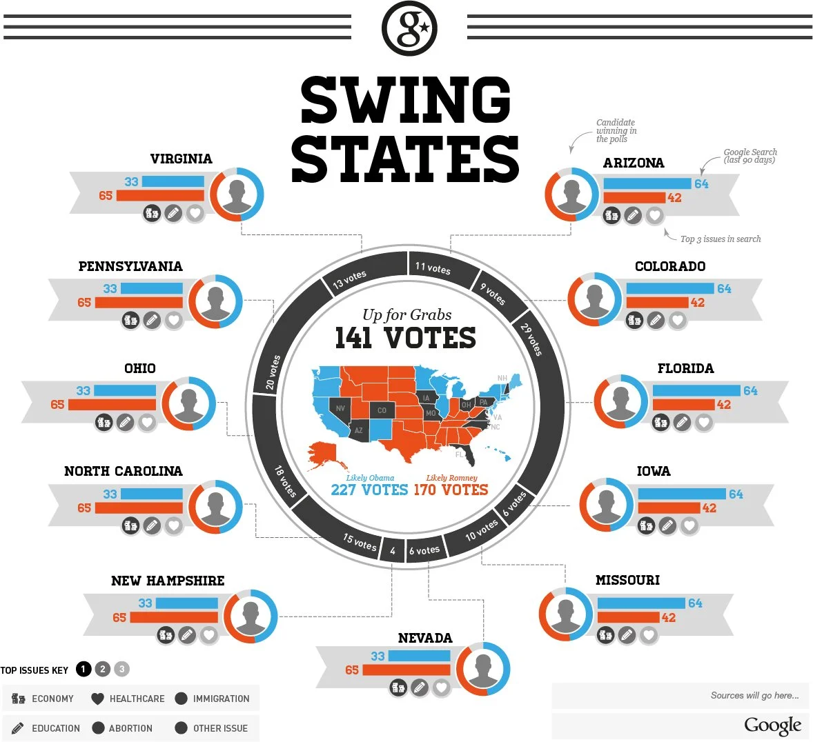
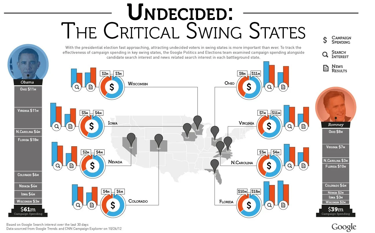
The initial release introduced the Trends Dashboard, offering a real-time snapshot of online political momentum by comparing candidates’ search traffic, YouTube views, news mentions, and other engagement metrics. Users could quickly filter election information by popularity, race, or issue, while media gained access to live trends, mapping tools, and videos from across the political spectrum.
As Election Day approached, the platform was designed to grow into a central destination where citizens could follow, understand, and engage with the digital campaign trail leading to the election of the next U.S. president.
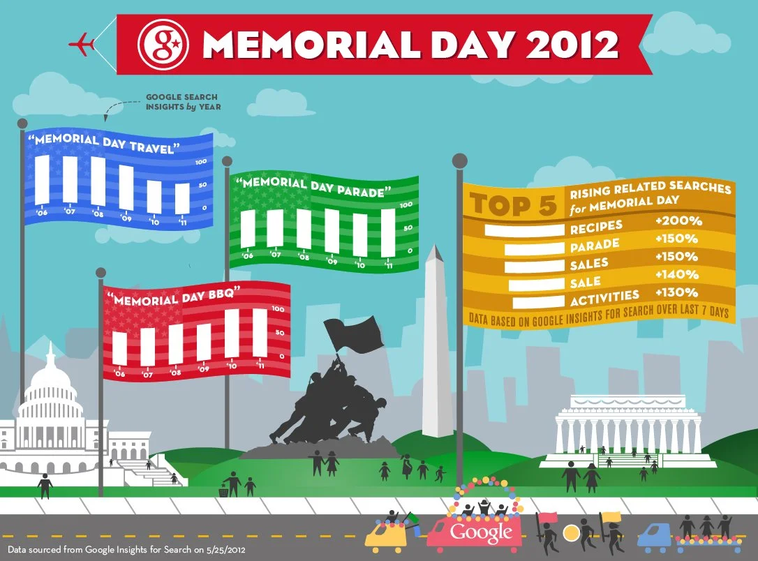
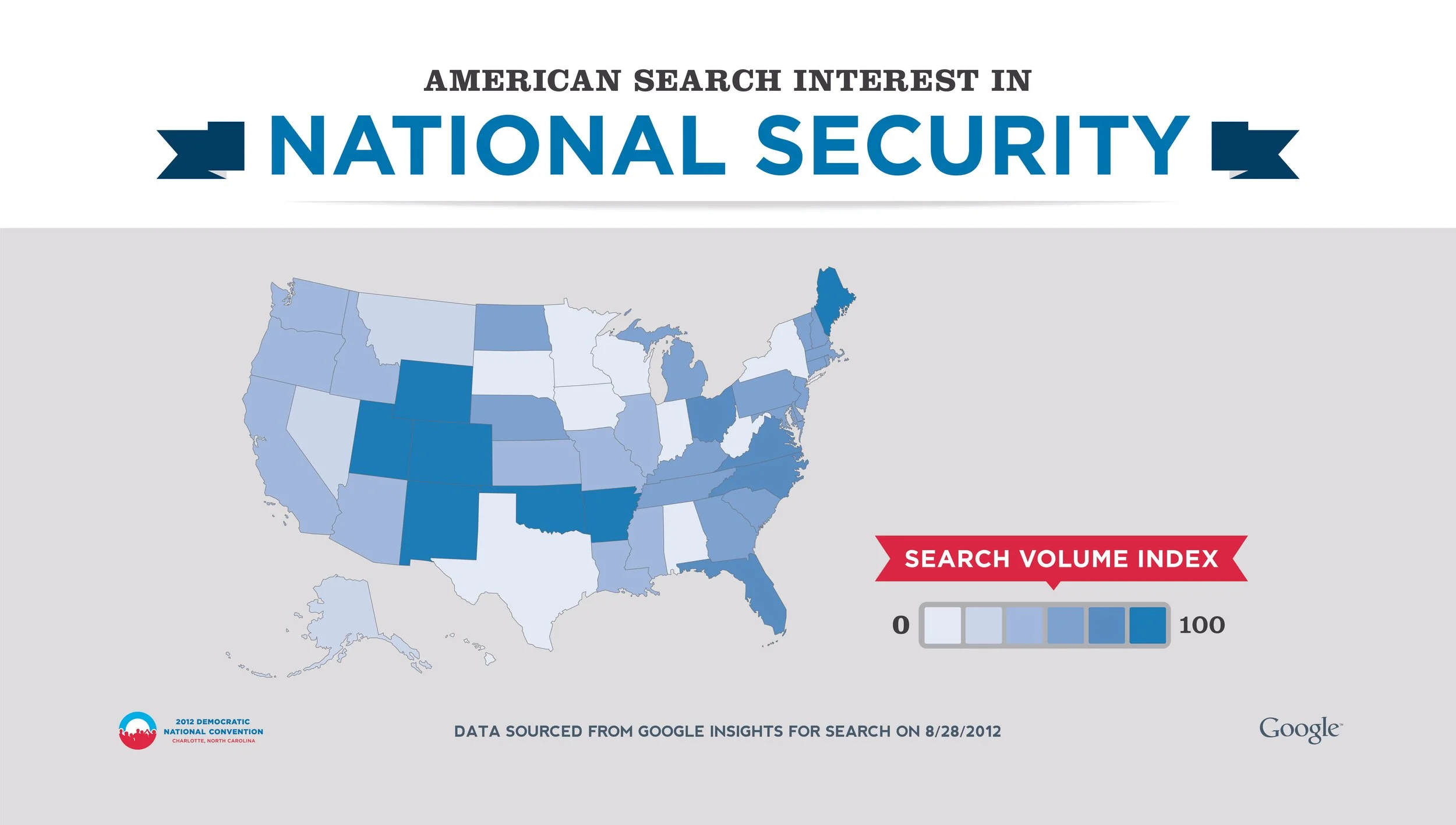
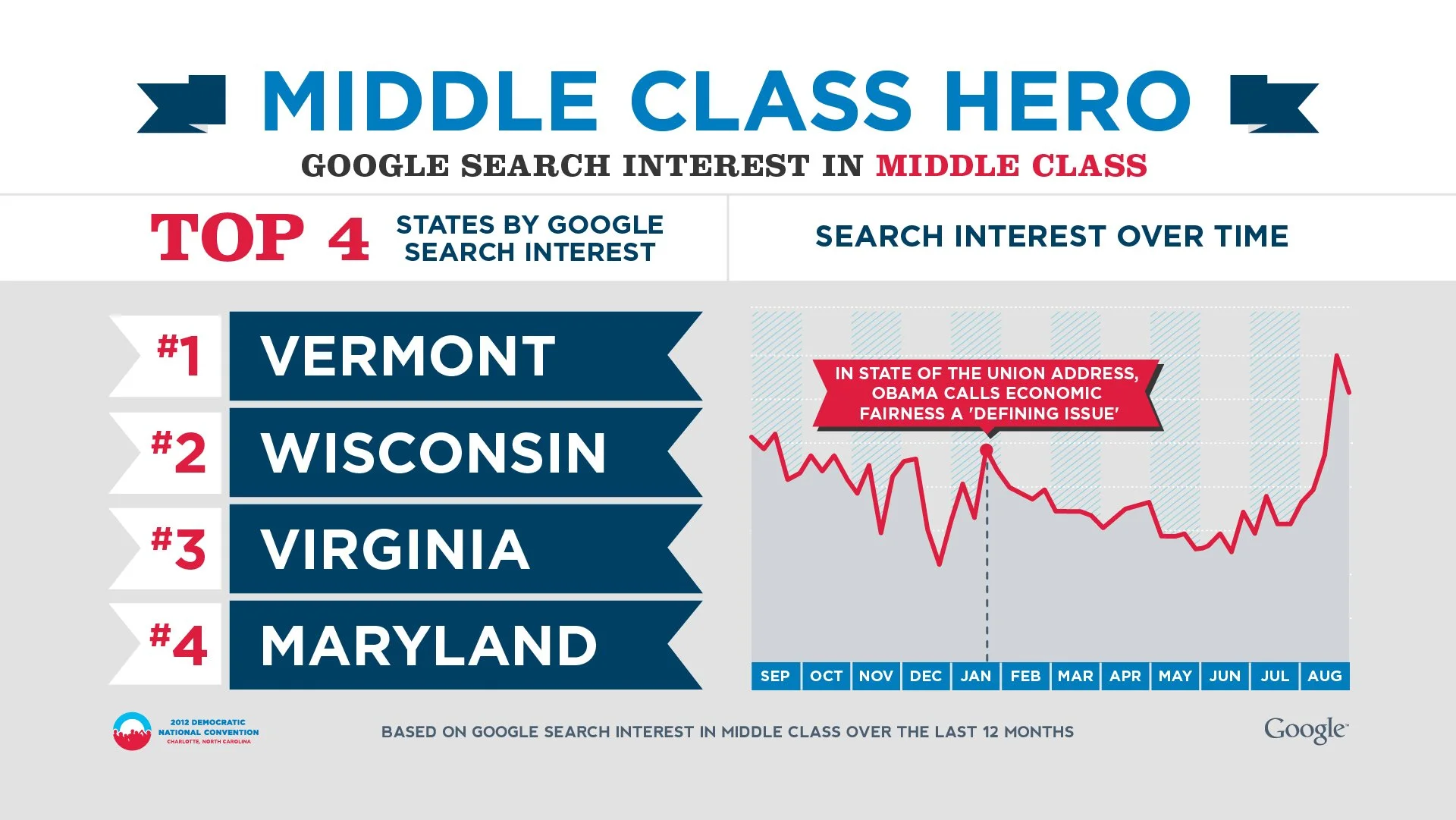
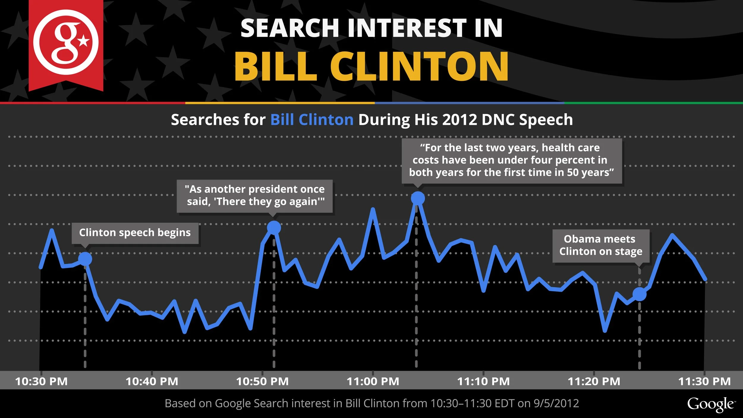
We took advantage of this wealth of data
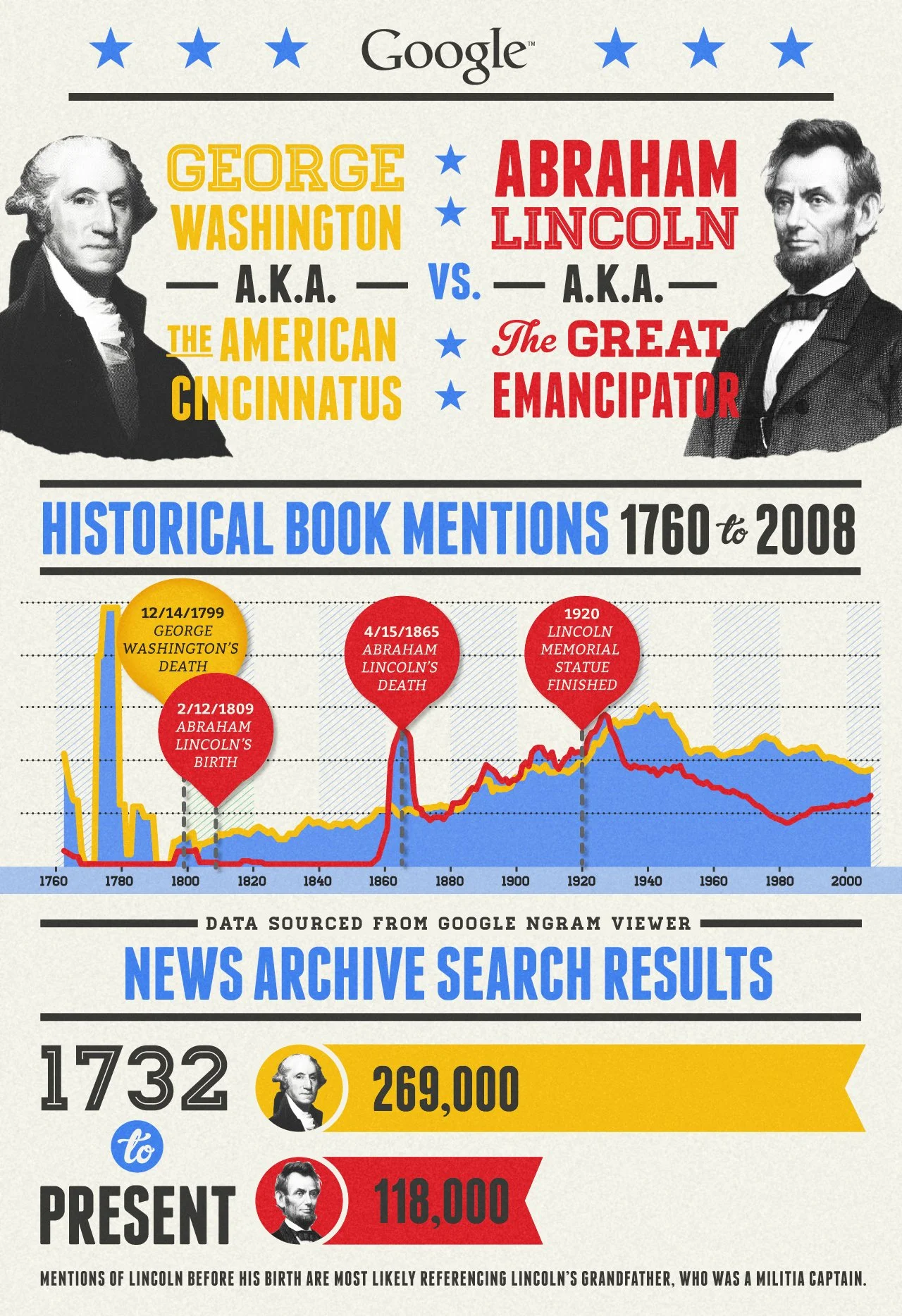
…but we knew that attentions are short during the election cycle, so we acted fast. We identified search trends and researched their significance in both current events and past events to draw out their significance.
The Process
This image might look complete, but we are just getting started! After we identify trends and relevant insights, it’s time to visually map out the data. That’s where wireframing comes in. Wire frames are the skeletal framework of the infographic. We need to ensure the data is easy to read, enforced by engaging visuals, and that it’s memorable. The client reviews every step of the way.
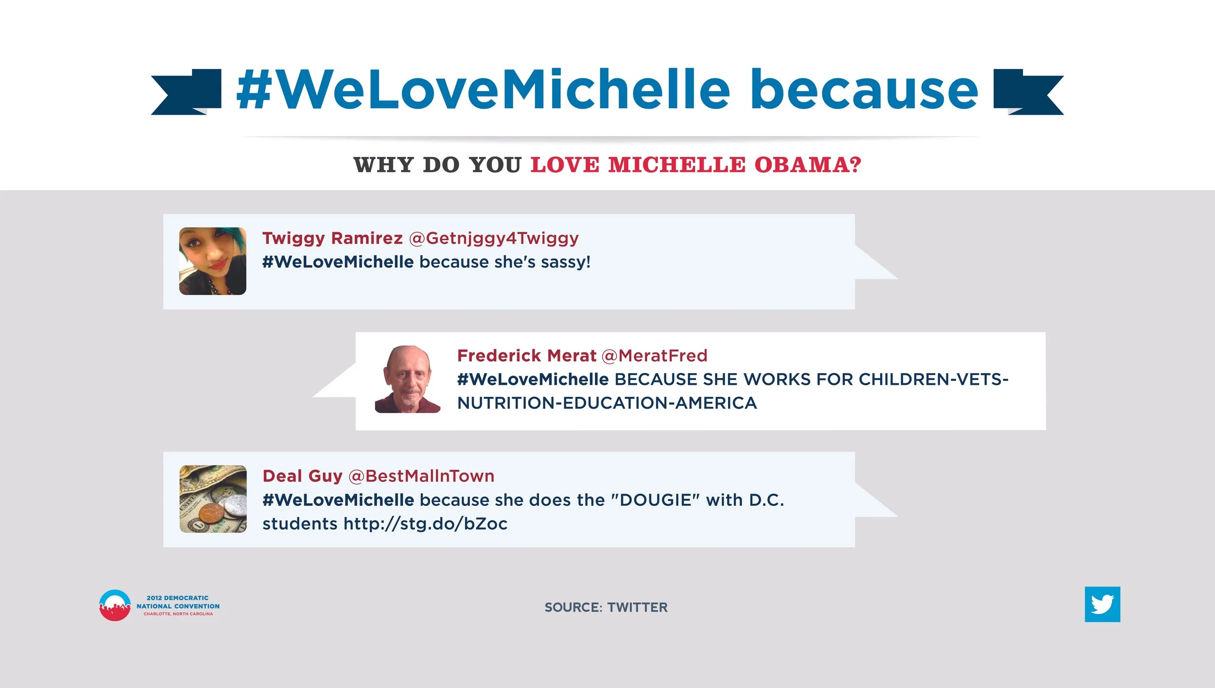
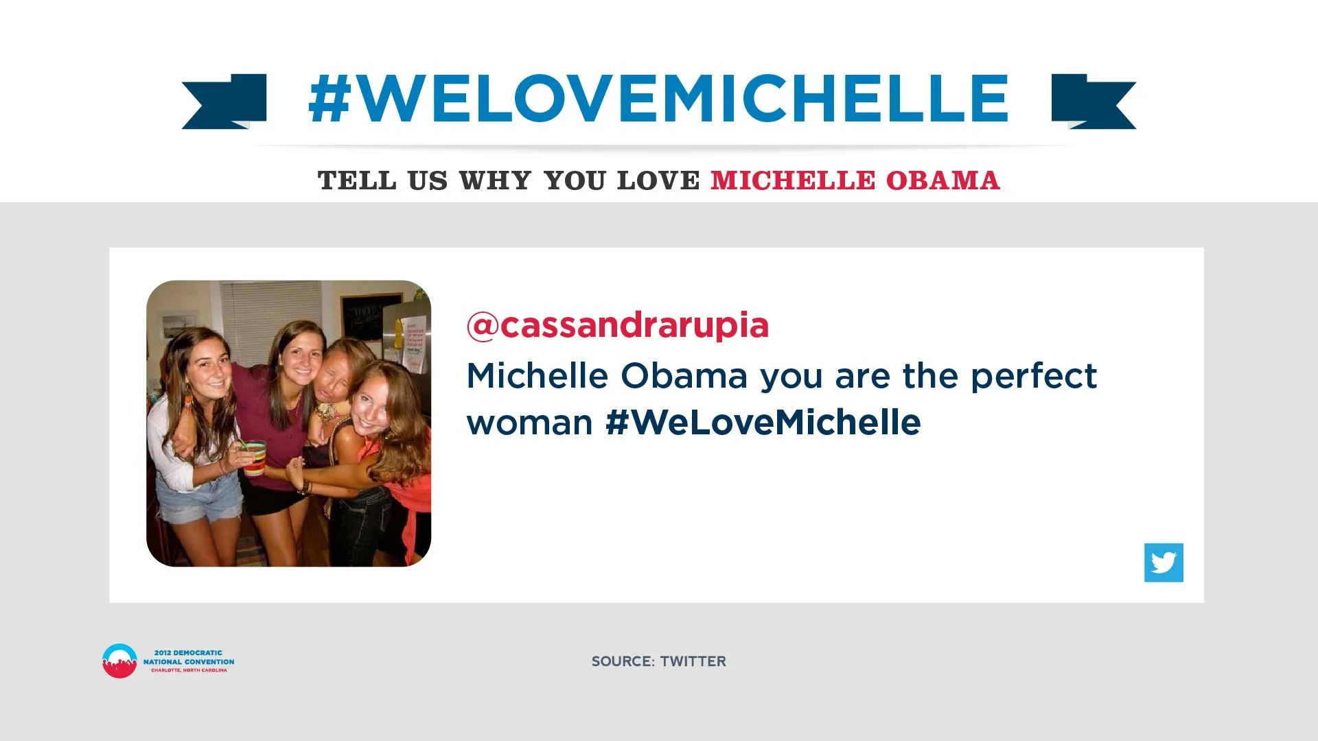
Glued to our Tweets
Moments like this move with a quickness. That’s why our team was on site at the DNC and RNC gathering data and creating visuals. We monitored social media during the debates and identified important conversations.
Want to learn more? Read about it here!