Power Not Persuasion: The Susan Sandler Legacy
We were tapped by SS Films and Sage Works Productions to create the key art film poster, website, and promotional materials for Power Not Persuasion: The Susan Sandler Legacy, a documentary film exploring the life and work of Susan Sandler — a strategist, philanthropic leader, and behind-the-scenes movement builder who played a major role in social justice, democracy, and equity causes. She championed incredible progressive candidates such a Barack Obama, Nikema Williams, Stacey Abrams, Corey Booker, and Nancy Pelosi. To share her impact, many appear in the film.
Key Art Film Poster
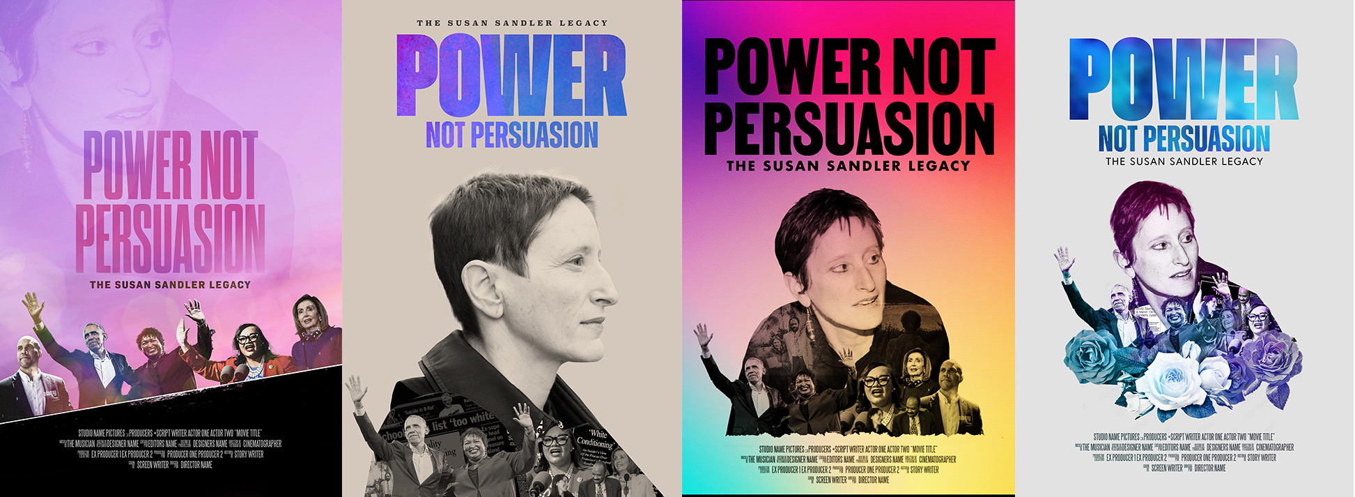
A key art poster is the main visual identity for a film that represents the project across all marketing materials. It’s designed to capture the essence of the story in one striking image. With this in mind, we aimed to highlight the people and organizations doing the work on the ground, giving them visibility and honoring their role, while paying homage to Susan. Here’s a peek into some of the options we considered.
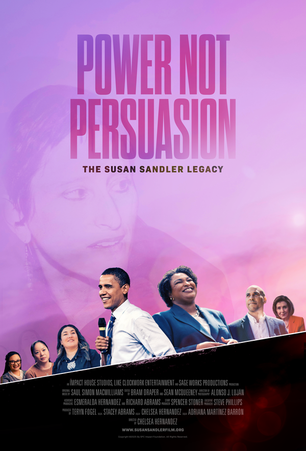
The Final Poster
The team opted for a layout that is clean and modern, with a cinematic, almost dreamlike quality. A pastel palette softens the surface, while the bold typography communicates strength and purpose.
We layered the film subjects to reinforce the idea of legacy, influence over time, and individuals interconnected by shared causes.
Unique Elements of Key Art Design
-

COMPOSITING AND RETOUCHING
Compositing lets designers build impossible shots that combine skies, cityscapes, characters, and effects that were never captured together. Retouching fine tunes these shots. Photoshop skills like this require an abundance of time and patience, and thus are becoming less common.
-

THE TYPOGRAPHY OF A BILLING BLOCK
Creating a billing block requires a mix of technical precision, design sensibility, and industry knowledge. Every name, title, and role must be spelled correctly and appear exactly as contractually required by union and studio standards while maintaining legibility and spacing consistency.
-

THE TITLE TREATMENT
A title treatment is one of the most important visual assets in a film’s identity. It’s the visual signature that audiences associate with the story. Its value extends across storytelling, marketing, and branding. A strong title treatment sets expectations before anyone sees a trailer.
The Website
We opted for a clean and modern aesthetic, with a predominantly white background and dark text, letting the content breathe and read clearly. This is essential for accessibility.
Strong visual elements give a sense of gravitas and authenticity, while humanizing the subject.
Navigation is simple: links to 5 sections appear clearly available.
The tone of language is both elevated and accessible to balance storytelling with mission, aiming to invite people in rather than intimidate.